Originally posted on March 3, 2010 @ 10:30 pm

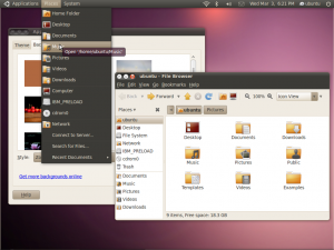
As much as I love Ubuntu Linux and all its open source glory, I really am not a fan of the current logo and the color scheme. Come on, brown. I understand that they took the current design inspiration from the word Ubuntu’s African roots, but that particular shade of brown they used isn’t exactly the most enticing thing to see.
Which is why I’m totally behind Canonical’s decision to change Ubuntu’s branding and the operating system’s color scheme into something more modern and sleeker. They believe that the new Ubuntu logo – which I love, by the way – will “reflect the precision and engineering that sits at the heart of the product. The new logo reflects this but not at the expense of the immediately recognisable circle of friends.”
They’re dropping the brown “Human” theme and introduced a new theme called Light:
The new style in Ubuntu is inspired by the idea of “Light”.
We’re drawn to Light because it denotes both warmth and clarity, and intrigued by the idea that “light” is a good value in software. Good software is “light” in the sense that it uses your resources efficiently, runs quickly, and can easily be reshaped as needed. Ubuntu represents a break with the bloatware of proprietary operating systems and an opportunity to delight to those who use computers for work and play. More and more of our communications are powered by light, and in future, our processing power will depend on our ability to work with light, too.
If you ask me, I say it’s about time. But I’m curious about what you guys think. Give me a piece of your mind via the comments!
[via]
